 Tina Perez English 110 Jay Lewenstein
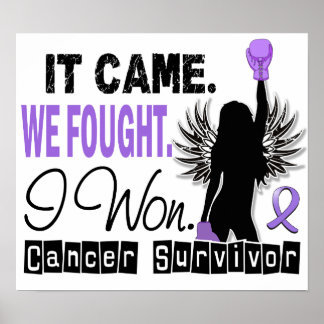
The message is clear:
It came. We fought. I won. The meaning, however, is deeper. “It” is referring
to Hodgkin lymphoma, which is a cancer. The poster is simple. Along with those
brief sentences there is a silhouette of a woman wearing purple boxing gloves.
The woman is in a victorious pose with her right hand in the air. She has large
dramatic wings along the upper portion of her body. The words, “Cancer
Survivor” is in bold blocked letters on the bottom of the poster. Purple is a
prominent color throughout the picture. There is also a purple ribbon on the
poster.
 The creator of this poster wants to
spread the message of survival. To be proud of yourself for conquering such
tough obstacles. The gloves signify a fight. A battle within yourself that was
won. The strength and courage it took to overcome cancer is worth celebrating.
“We” is everyone that helped the patient get to that point. Family members,
friends, and communities that are supportive mean the world. No one can do it
alone. I like that the poster acknowledges others, but also doesn’t take the
victory away from the cancer patient. Purple is the color of Hodgkin lymphoma. The
wings represent bravery. Facing fears and overcoming tough times give you the
power to make you feel like you can fly. Like your unstoppable and nothing can
bring you down. The intended audience is females. There is a women on the
poster and it calls for female empowerment. Although no facial features are
detectable, the figure appears female. The author uses pathos in order to reach
viewers. The words are emotional, especially to a cancer survivor. They hold a
lot of meaning and honesty.
The creator of this poster wants to
spread the message of survival. To be proud of yourself for conquering such
tough obstacles. The gloves signify a fight. A battle within yourself that was
won. The strength and courage it took to overcome cancer is worth celebrating.
“We” is everyone that helped the patient get to that point. Family members,
friends, and communities that are supportive mean the world. No one can do it
alone. I like that the poster acknowledges others, but also doesn’t take the
victory away from the cancer patient. Purple is the color of Hodgkin lymphoma. The
wings represent bravery. Facing fears and overcoming tough times give you the
power to make you feel like you can fly. Like your unstoppable and nothing can
bring you down. The intended audience is females. There is a women on the
poster and it calls for female empowerment. Although no facial features are
detectable, the figure appears female. The author uses pathos in order to reach
viewers. The words are emotional, especially to a cancer survivor. They hold a
lot of meaning and honesty.
The words of the advertisement emphasize
the picture with symbolism. “Fought” is one of the words used and boxing gloves
are shown on the poster. Those two go hand in hand. The words “I won,” are also
used and in the poster the female is in a victorious pose with one of her hands
held up in the air. It reminds me of a boxing match. The referee signifies a
winner by raising their arm up in the air. It’s the same concept. The only
thing the creator left out on this poster would be some male influence. I think
a more balanced poster should appeal to both genders.
No comments:
Post a Comment